Government intervention impacts crypto

Cryptocurrencies traded lower since yesterday as regulatory concerns re-emerged. Bitcoin broke the initial support 34,000 more than the initial support, down 5% in the last 24 hours. Cryptocurrency might stabilize around $30,000, which is the bottom of the one-month trading range. Growing concerns from regulators have weighed on cryptocurrency prices over the past few months. This week, China’s repression intensified when the country’s central bank issued a warning about the dangers of staple coins.

As per latest news, Bitcoin and many crypto trading agencies around the world are basically facing global repression, and it looks like there may be a new competitor to the top spot. Fan Yifi, deputy governor of the People’s Bank of China (BPOC), said on Thursday that “global sustainable institutions could pose risks and challenges to the international monetary system.” The banker also said that the central bank was already taking action against cryptocurrencies.

In Europe, many countries are proposing to create a new company to curb cryptocurrencies that can be used for money laundering. Concerns also include terrorist financing and organized crime that need to be looked at the EU level, according to documents reviewed by Reuters on Thursday.

Crypto is under pressure for a variety of reasons: government and regulatory repression of Bitcoin, environmental concerns over the mining of crypto tokens, and an appetite for highly volatile risk assets. Technology business pressures may also coexist. Trading volume has declined over the summer, making cryptocurrencies more volatile and vulnerable to sales pressure.

On the positive side of crypto, Visa announced on Wednesday that consumers around the world spent $1 billion globally on cryptocurrency crypto-linked Visa cards in the first six months of the year. The payment company also said it was partnering with 50 leading crypto platforms to launch easy-to-use card schemes to convert and spend digital currency for 70 million merchants worldwide.

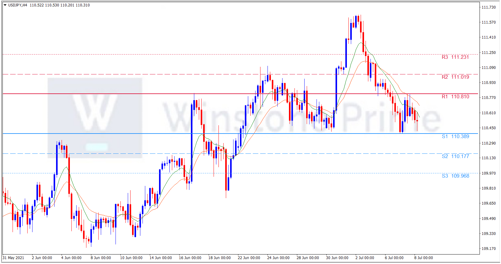
BTC/USD 4 Hour Chart:

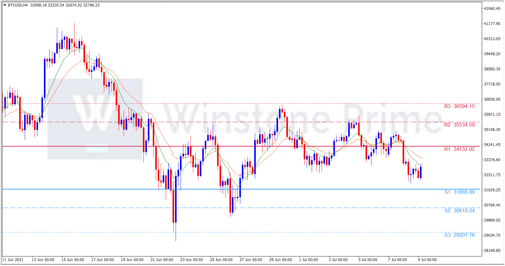
Support: 31669.9 (S1), 30610.2 (S2), 29207.8 (S3).

Resistance: 34132.0 (R1), 35534.5 (R2), 36594.2 (R3).

Meanwhile, the repression of global cryptocurrencies is turning BTC into a sales mindset and the Visa partnership is giving BTC traders confidence. We expect an intermittent trend for BTCUSD.

Rising oil price raises concern among traders

The coronavirus pandemic has created an economy overheating and rising inflation in the United States. Which suppress the US dollar into bearish trend and the main reason is rising in oil and gasoline prices. Rising oil and gasoline prices pushes the US economy into challenges. West Texas Intermediate, the U.S. oil-price bench mark, hit $76.98 a barrel on Tuesday, its highest level in six years, as OPEC, Russia and their allies again failed to agree on production increases.

U.S. oil companies have been cautious about investing in new exploration and production over the last year, even as oil prices have roughly doubled from the first half of 2020, when the pandemic punctured demand. The Energy Department predicts that production will average 11.1 million barrels a day this year and 11.8 million barrels a day in 2022, 400,000 barrels a day less than in 2019. Even without a surge in domestic oil production, many forecasters doubt that prices will continue to rise at their recent pace.

OPEC members generally agree that production should increase; they just disagree about how much. At the same time, the spread of new coronavirus variants has led some countries to reimpose or tighten restrictions on activity, which could dampen demand for oil. Capital Economics, a forecasting firm, said Tuesday that it expected oil prices to peak at about $80 a barrel before falling back as supply increases. But the firm said that a collapse in prices or a further spike both remained possible.

The very real risk of economic overheating by yearend can be gauged by comparing the very large size of the budget stimulus that the economy is now receiving to the estimated gap between the economy’s current level of production and that level it could attain at full employment.  Heightening the chances that excessive fiscal stimulus will lead to economic overheating is the fact that the broad money supply continues to grow very rapidly while monetary policy conditions are now the easiest that they have been in more than a decade.

Further adding to demand-side inflation pressures will be the all too likely continued drawdown of the estimated $2 trillion in excess household savings that were built up during the Covid lockdown. All of this makes the Fed’s current monetary policy pronouncements very troubling. At a time that inflation appears to be accelerating and at a time that the economic overheating risk is becoming ever more likely, the Fed keeps telling us that there will be no need to raise interest rates till 2023.

USD/JPY 4 Hour Chart:

Support: 110.39 (S1), 110.18 (S2), 109.97 (S3).

Resistance: 110.81 (R1), 111.02 (R2), 111.23 (R3).

Amidst this the rising oil prices, upward gasoline prices and rising inflation causes US into pessimistic view. We expect a bearish trend for USD/JPY.

Rising covid cases impacts pound

The GBP staggered low against the dollar on Wednesday after disappointing the Covid cases increases in Britain which raised doubts about the strength of the economic recovery, while the dollar awaited the Federal Reserve’s minutes from its last policy meeting. Yields have plummeted in recent weeks as many speculators bet that rising inflation could trigger the Federal Reserve to tighten its policy, forcing them to bail out of their positions soon. However, the minutes of the central bank’s June policy meeting on Wednesday may provide new insights into its policy outlook.

“Many expect the Fed to drop the typing notes in August, saying it will be considered in September and implemented in December. But I hope the central bank can move beyond that deadline”, said Daisuke Uno, chief strategist at Sumitomo Mitsui Bank. The important thing is that the Fed has already raised its inflation forecast. “

At the same time IANS Tweets ‘latest tweet states,’ #Britain reported another 28,773 #coronavirus cases in the latest 24-hour period, the highest daily increase since late January, according to official figures released on Tuesday. Chris Witty warned today that Britain will not return to pre-epidemic levels this year despite pressure from ministers ahead of Independence Day. Admission and deaths at Govt Hospital are expected to rise in the weeks and months after July 19, when all social distance measures are to be scrapped in the UK.

Sir Alex Younger, the former head of MI6, has warned that “the threat to the UK from terrorist groups such as Al Qaeda could increase if the Allies turn to Afghanistan after the withdrawal of troops. Sir Alex, a veteran of the fight against terrorism following the September 11 attacks on the United States, predicts that the outcome for Afghanistan now could be a civil war between the resurgent Taliban and the US and UK-backed Afghan government” revealed in Sir Alex’s first televised interview.

GBP/USD 4 Hour Chart:

Support: 1.3745 (S1), 1.3696 (S2), 1.3620 (S3).

Resistance: 1.3871 (R1), 1.3947 (R2), 1.3996 (R3).

Amidst this the Raising cases of covid influence the GBP negatively and traders are awaiting for FOMC decision. As of now we expect a bearish trend for GBP/USD.

Golden Cross and Death Cross

Chart patterns are abundant trading tool​ that should be utilised as part of your technical analysis strategy. However, there are many other patterns out there that can be useful for day traders, swing traders and long-term investors. Moving average is one of the patterns among it.

Moving average Crossover

Moving average is a line plotted over a price chart that measures the currency average price for a given time frame. Moving averages define the trend and provide support or resistance. They also give trading signals when they move through each other. These signals are called “moving average crossovers.” A crossover signal is generated when a shorter moving average crosses over a long term one and vice versa. When the shorter-term moving average crosses above the longer-term moving average, it creates a buy signal. When the shorter-term moving averages crosses below the longer-term, a sell signal is given.  Different combinations of moving averages can be used to guide trading decisions. Observing when the cross occurs in real time can, therefore, provide a very valuable buy or sell signal.

Traders often use these indicators in conjunction with other short-term indicators to flag changing trends. Different traders have different opinions on the Golden Cross and Death Cross, and this has prompted some lively discussions. So, how can traders use both these signals to their benefit?

Golden Cross can be seen as a Holy Grail of bullish technical indicators in the eyes of many traders. To flatten out short-term volatility, traders traditionally use the 50-day moving average and the 200-day moving average. When a 50-day moving average moves up through the 200-day moving average, they often see it as a confirmation of an emerging bullish trend, mainly due to the lag on the two moving averages. In theory, it indicates short-term momentum and a potential change in trend direction.

What Does the Golden Cross mean You?

When you encounter a Golden Cross, it is safe to say that no two charts are ever identical. However, there are three distinct stages of the Golden Cross, which are:

Buyers taking control of a downtrend

By definition, due to short-term weakness in the 50-day moving average, a Golden Cross will occur after a downtrend. The resulting strength in the 50-day moving average comes about when the short term sellers dry up, and the buyers begin to take control. The chart will level out, and then buyers move into the driving seat, with the price moving higher.

Momentum moves the 50-day average through the 200-day average

This is the turning point. If the upward momentum continues, the 50-day moving average will eventually push up through the 200-day moving average. This is the point at which the eyes of many traders will light up! Is this a new trend or a false flag?

Consolidation, then resume up trend

When the 50-day moving average moves sharply up through the 200-day moving average, it indicates strong momentum. Sometimes this can lead to short-term overbought situations. Technical charts often reflect these cases in periods of consolidation, sideways trading, or partial retracement. This is the key moment. If the asset price trend is changing, the buyers will eventually regain control, moving the asset price to higher ground.

Many traders make the mistake of buying too early. The critical error here is to buy before the uptrend has been confirmed, and the period of consolidation is over. If you invest too early, you may encounter a pullback towards the 200-day moving average. This may lead to a retracement below the trendline. There is an easy way to tell what degree of risk traders are willing to take. It depends on whether they wait and see the trend’s confirmation after what they expect to be a consolidation period.

Example of a Golden Cross

Next, we will demonstrate a Golden Cross and how the trend may progress. To that end, we will use the EURUSD as an example. Let’s look at the chart below. The pink line (indicating the 50-day moving average) moved up through the brown line (indicates the 200-day moving average). At that point, the index went into a period of consolidation. Afterward, it briefly fell back below the 50- and 200-day moving averages. However, while the 50-day moving average remains above the 200-day moving average, we consider the trend intact.

Once we could confirm the change in trend towards the end of the area marked by the box, this resulted in a significant upward movement in the index. Even though this period of consolidation/sideways trading is perhaps more elongated than normal, it does highlight the various stages of a changing trend.

Death Cross is the exact opposite of a Golden Cross. It indicates the weakening of a positive trend and the emergence of a bearish trend. Very often, due to growing short-term downward momentum, this can lead to a short-term oversold situation. It is not uncommon for the index level to rebound on or around the Death Cross date. Much like an overextended elastic band snapping back, this is all part of the Death Cross process. However, it can prompt some inexperienced traders to discount the signs of a potentially changing trend.

Example of a Death Cross

The following chart perfectly illustrates the various stages of an emerging downward trend. In particular, you should take a close look at the area in the box. As you will see, the currency had been stuck in a trading range for some time before the sellers took control, pushing the currency lower. Interestingly, the crossover period came just after a sharp sell-off. There was then a few days of consolidation, another sharp sell-off, and then another period of consolidation. 

Experienced traders would have waited until confirming the emerging downtrend towards the end of the shaded area. Yes, they would have missed some of the earlier downturns, but the trend would have, in their eyes, been all but certain. Consequently, this led to a 300+ point fall in the USDJPY pair and a relatively quick recovery. The market reached its bottom at around 104.647. The recovery was fairly strong.

Add some additional technical indicators

When looking at a potential Golden Cross or Death Cross, it is worth looking at other technical indicators. Because these cross-tech events are based on a moving average, they may be relatively late, even if they are indicators of a changing trend. It is therefore useful to take into account other technical indicators. Examples include stochastic oscillator, Bollinger Bands, moving average convergence divergence and comparative strength index. These are many indicators, we have listed only a few. 

Use stop-loss limits

Although technical indicators are easy for those involved in short, medium and long term futures trading, it is still advisable to use stop-loss limits. Those who want to invest in the “new trend” take pre-calculated risk before waiting to confirm it. If the trend is confirmed, they will likely have more upside potential, having taken a greater risk at a lower level.  If the trend fades and the index returns to its previous trading range, a stop-loss limit will control most vulnerability.

Those who use Golden Cross and Death Cross successfully in their investment strategies are flexible and ready to react to change. Technical indicators that support the changing trend, you have to go to that new trend. However, once the trend is confirmed it is still not simply a case of buying currencies and taking your eye off the ball.

Conclusion

We discussed both, so it’s not hard to understand the difference between them. They are essentially polar opposites of each other. The golden cross can be considered a bullish signal, while death crosses considered a bearish signal. Both can be confirmed by a high trade volume.

Some technical analysts may also check other technical indicators when looking at the crossover environment. What’s also important to remember is that moving averages are lagging indicators and have no predictive power. This means that both shortcuts usually provide a strong reversal of a trend that has already taken place – not a reversal that is already underway.