Chart patterns are abundant trading tool that should be utilised as part of your technical analysis strategy. However, there are many other patterns out there that can be useful for day traders, swing traders and long-term investors. Moving average is one of the patterns among it.
Moving average Crossover
Moving average is a line plotted over a price chart that measures the currency average price for a given time frame. Moving averages define the trend and provide support or resistance. They also give trading signals when they move through each other. These signals are called “moving average crossovers.” A crossover signal is generated when a shorter moving average crosses over a long term one and vice versa. When the shorter-term moving average crosses above the longer-term moving average, it creates a buy signal. When the shorter-term moving averages crosses below the longer-term, a sell signal is given. Different combinations of moving averages can be used to guide trading decisions. Observing when the cross occurs in real time can, therefore, provide a very valuable buy or sell signal.
Traders often use these indicators in conjunction with other short-term indicators to flag changing trends. Different traders have different opinions on the Golden Cross and Death Cross, and this has prompted some lively discussions. So, how can traders use both these signals to their benefit?
Golden Cross can be seen as a Holy Grail of bullish technical indicators in the eyes of many traders. To flatten out short-term volatility, traders traditionally use the 50-day moving average and the 200-day moving average. When a 50-day moving average moves up through the 200-day moving average, they often see it as a confirmation of an emerging bullish trend, mainly due to the lag on the two moving averages. In theory, it indicates short-term momentum and a potential change in trend direction.
What Does the Golden Cross mean You?
When you encounter a Golden Cross, it is safe to say that no two charts are ever identical. However, there are three distinct stages of the Golden Cross, which are:
Buyers taking control of a downtrend
By definition, due to short-term weakness in the 50-day moving average, a Golden Cross will occur after a downtrend. The resulting strength in the 50-day moving average comes about when the short term sellers dry up, and the buyers begin to take control. The chart will level out, and then buyers move into the driving seat, with the price moving higher.
Momentum moves the 50-day average through the 200-day average
This is the turning point. If the upward momentum continues, the 50-day moving average will eventually push up through the 200-day moving average. This is the point at which the eyes of many traders will light up! Is this a new trend or a false flag?
Consolidation, then resume up trend
When the 50-day moving average moves sharply up through the 200-day moving average, it indicates strong momentum. Sometimes this can lead to short-term overbought situations. Technical charts often reflect these cases in periods of consolidation, sideways trading, or partial retracement. This is the key moment. If the asset price trend is changing, the buyers will eventually regain control, moving the asset price to higher ground.
Many traders make the mistake of buying too early. The critical error here is to buy before the uptrend has been confirmed, and the period of consolidation is over. If you invest too early, you may encounter a pullback towards the 200-day moving average. This may lead to a retracement below the trendline. There is an easy way to tell what degree of risk traders are willing to take. It depends on whether they wait and see the trend’s confirmation after what they expect to be a consolidation period.
Example of a Golden Cross
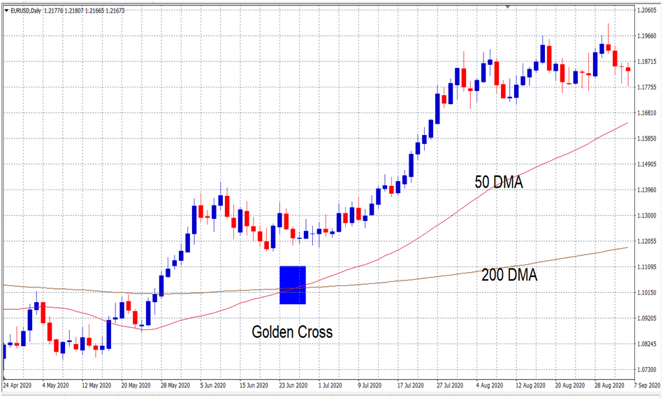
Next, we will demonstrate a Golden Cross and how the trend may progress. To that end, we will use the EURUSD as an example. Let’s look at the chart below. The pink line (indicating the 50-day moving average) moved up through the brown line (indicates the 200-day moving average). At that point, the index went into a period of consolidation. Afterward, it briefly fell back below the 50- and 200-day moving averages. However, while the 50-day moving average remains above the 200-day moving average, we consider the trend intact.

Once we could confirm the change in trend towards the end of the area marked by the box, this resulted in a significant upward movement in the index. Even though this period of consolidation/sideways trading is perhaps more elongated than normal, it does highlight the various stages of a changing trend.
Death Cross is the exact opposite of a Golden Cross. It indicates the weakening of a positive trend and the emergence of a bearish trend. Very often, due to growing short-term downward momentum, this can lead to a short-term oversold situation. It is not uncommon for the index level to rebound on or around the Death Cross date. Much like an overextended elastic band snapping back, this is all part of the Death Cross process. However, it can prompt some inexperienced traders to discount the signs of a potentially changing trend.
Example of a Death Cross
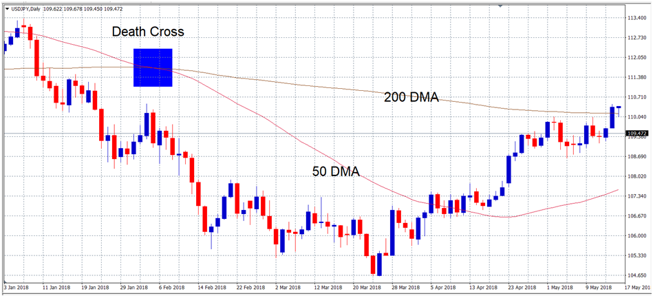
The following chart perfectly illustrates the various stages of an emerging downward trend. In particular, you should take a close look at the area in the box. As you will see, the currency had been stuck in a trading range for some time before the sellers took control, pushing the currency lower. Interestingly, the crossover period came just after a sharp sell-off. There was then a few days of consolidation, another sharp sell-off, and then another period of consolidation.
Experienced traders would have waited until confirming the emerging downtrend towards the end of the shaded area. Yes, they would have missed some of the earlier downturns, but the trend would have, in their eyes, been all but certain. Consequently, this led to a 300+ point fall in the USDJPY pair and a relatively quick recovery. The market reached its bottom at around 104.647. The recovery was fairly strong.

Add some additional technical indicators
When looking at a potential Golden Cross or Death Cross, it is worth looking at other technical indicators. Because these cross-tech events are based on a moving average, they may be relatively late, even if they are indicators of a changing trend. It is therefore useful to take into account other technical indicators. Examples include stochastic oscillator, Bollinger Bands, moving average convergence divergence and comparative strength index. These are many indicators, we have listed only a few.
Use stop-loss limits

Although technical indicators are easy for those involved in short, medium and long term futures trading, it is still advisable to use stop-loss limits. Those who want to invest in the “new trend” take pre-calculated risk before waiting to confirm it. If the trend is confirmed, they will likely have more upside potential, having taken a greater risk at a lower level. If the trend fades and the index returns to its previous trading range, a stop-loss limit will control most vulnerability.
Those who use Golden Cross and Death Cross successfully in their investment strategies are flexible and ready to react to change. Technical indicators that support the changing trend, you have to go to that new trend. However, once the trend is confirmed it is still not simply a case of buying currencies and taking your eye off the ball.
Conclusion
We discussed both, so it’s not hard to understand the difference between them. They are essentially polar opposites of each other. The golden cross can be considered a bullish signal, while death crosses considered a bearish signal. Both can be confirmed by a high trade volume.
Some technical analysts may also check other technical indicators when looking at the crossover environment. What’s also important to remember is that moving averages are lagging indicators and have no predictive power. This means that both shortcuts usually provide a strong reversal of a trend that has already taken place – not a reversal that is already underway.
